Illusion

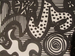
These are abstract figures decorated in black and white. For this sketch I used a black permanent marker and a ruler to create parallel lines on the background. The goal for this project was to create an illusion. So it is possible to see various shapes and textures in the same colors and connecting with each other. It is a different image because it gives you a various figures to interpret. It can also be interesting since there are shapes surrounding the whole paper while compensating each other. Even though they can be completely different from each other, they do work well together.
On this project my strengths where creating the shapes. I find it very easy to draw and it came out of my imagination very fluently. What I find it a little bit more challenging was when I had to create textures for every shape. They could not be similar because it damaged the whole concept. It was hard since many of them I have already used or where similar. I had to do a little research that was when I came up with the idea of the star shaped concept and the spiral. That helped me because it gave it a touch of more creativity and uniqueness.
On this project my strengths where creating the shapes. I find it very easy to draw and it came out of my imagination very fluently. What I find it a little bit more challenging was when I had to create textures for every shape. They could not be similar because it damaged the whole concept. It was hard since many of them I have already used or where similar. I had to do a little research that was when I came up with the idea of the star shaped concept and the spiral. That helped me because it gave it a touch of more creativity and uniqueness.
Overlaps

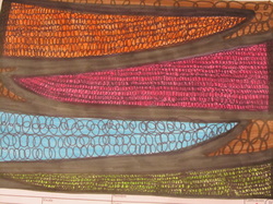
This is my second project. For this sketch it was a little bit more complex since I used various more colors and variation of shapes. My idea was to make people believe that there is a much bigger different in the triangular shapes then there truly is. The curve rotations change size in every triangle. Making the idea of the paper to cause a much bigger difference in sizes. I used markers, which consisted with the colors brown, pink, orange, baby blue, light green and black. I chose these colors because they are serious but still alive. The orange and green give it a tone of happiness while the black and brown give it the balance to make it look more professional.
I gave a lot of effort in this project. I used plenty of time planning and creating the project. What made it easy were the spirals since it was a easy idea that looks really good. The various sizes made the project more interesting and sophisticated. What challenged me was connecting the triangles because they where supposed to be the same size but it did not turn out that way. At the end, there was no big difference in the size of the triangles and it looked organized and original.
I gave a lot of effort in this project. I used plenty of time planning and creating the project. What made it easy were the spirals since it was a easy idea that looks really good. The various sizes made the project more interesting and sophisticated. What challenged me was connecting the triangles because they where supposed to be the same size but it did not turn out that way. At the end, there was no big difference in the size of the triangles and it looked organized and original.
Battlefield

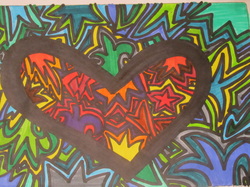
For me, this was my most artistic sketch of all. It represents the different situations in which love can be in. Tones of blue, green, yellow and gray represent that may times love can come with sorrow, regret, and a lot of pain. The bigger curves represent bigger problems and bigger sadness the heart had gone over. Even though there is various problems going outside the heart, it is still passionate and burning with fire. The colors red, purple, yellow, and brown signify that love can overcome anything. It does not matter how big a problem is, love can finds its way trough. These colorful colors represent love, passion, and energy to go and give love to the rest.
I am really proud of myself in this project since I gave a lot of effort. I find it vivid, energetic, passionate, interesting and artistic. I discovered bigger likes when I did this because I felt so happy that all I waned was to do another one. My strengths were the shapes and the idea. They worked with each other amazingly. My disadvantages were that I did not know what colors to represent sadness. After brainstorming I found it perfect to use tones of green and blue.
I am really proud of myself in this project since I gave a lot of effort. I find it vivid, energetic, passionate, interesting and artistic. I discovered bigger likes when I did this because I felt so happy that all I waned was to do another one. My strengths were the shapes and the idea. They worked with each other amazingly. My disadvantages were that I did not know what colors to represent sadness. After brainstorming I found it perfect to use tones of green and blue.
Martina H. 9B
